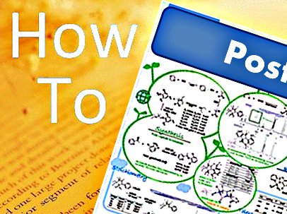
Presenting posters and leading the conversation in a poster session can be intimidating. However, there are some very simple things that you can do to help yourself get through what can be a challenging experience. Richard Threlfall, Managing Editor, Asian Journal of Organic Chemistry, gives you some tips on how to plan and design an outstanding poster and how you can make sure that you present your poster like a pro.
Planning Your Poster
When planning how to tell the story of your research on your poster, you should first consider a couple of the realities of scientific poster presentations. Firstly, a note on format. Whereas in former years putting up a collection of 12 or so printed slides was acceptable as a poster presentation, these days computer programs for producing posters are so widely accessible and easy to use that there is really no excuse for using slides instead of making a poster. This looks a little amateurish and if you can make slides, then you can definitely make a poster. So come on, let your artistic side out!
You know if you’ve been to poster sessions before that, in general, a person walking by may spend a few moments looking at a poster but will actually read very little of the text. This means you should be thinking of how to tell your story as visually as possible. Also remember that you won’t be with your poster at all times during the conference, but that doesn’t mean that people won’t be looking at it. Therefore, you need to make it as self-explanatory and easy to navigate as possible.
The title of your poster should be short and catchy, but it should also be concise to avoid taking up too much space when it’s written in a big font. You should use reactions schemes, X-ray structures, graphs, western blots, or anything else that you can make into something highly visual to show that key breakthrough moment in your project. Photographs are particularly effective for this, as they are somehow more “real”, but spectra can be less effective, especially if they require any interpretation.
Of course, text can’t be avoided completely but use it only where necessary to provide that little bit of extra explanation for the really interested viewer. Use bullet points or short lists of the key points you want to make, and don’t be afraid to annotate images, even with things that you think are really obvious because they won’t be obvious to everyone. For example, if you have an important band on an electrophoresis gel, label it with something eyecatching, such as: “This band confirms the structure of the target!”.
Lastly, try to leave a couple of “leads” for questions. This doesn’t mean that you should leave any important data out, but you should try to design your poster in such a way that there are some opportunities for the viewer to ask questions. For example, you can leave hints to optimisation work that you might have done on a reaction by adding an asterisk to a reaction scheme: “*Best conditions identified after testing 25 solvents and 12 catalysts.” The obvious question is then what the other solvents and catalysts were. This saves you valuable poster space by not having to list all the results of the optimisation work on the poster, but it still gives you the chance to talk about them. You can prepare answers to these potential questions before the conference so as you are fluent in answering them if they come up in the poster session. This approach will increase your confidence and your chances of impressing those all-important judges of the poster prize.
- Next month: Designing Your Poster
Also of interest
- Wonderlab Comic – Poster Session,
Sophie Lin,
ChemViews Mag. 2012.
DOI: 10.1002/chemv.201200133
Ever struggled to engage a student in a conversation at a poster session? Wonderlab explores some of the reasons why - Tips for Better Science Writing Articles