
Have you ever struggled to write up your results into a publishable paper only to get it rejected? In previous parts, Richard Threlfall, Managing Editor, Asian Journal of Organic Chemistry, gave some insider tips on how to improve each section of your article and increase your chances of getting published. Here, he looks at what makes a good cover picture or frontispiece to help increase the visibility of your paper once it’s been accepted.
Cover Art
So the hard work is finally complete. Your manuscript is accepted and now it’s time to inject a little fun by making a cover picture for your chosen journal.
When you think of creating a cover picture to send to a journal, perhaps the Ig-Nobel Prize doesn’t immediately spring to mind. However, the motto of the Ig-Nobel Prize – “Research that makes people LAUGH and then THINK” – is a good starting point from which to think about your cover art. Your illustration does not necessarily have to make people laugh, but what you do want is an image that makes a big first impression on the readers, and then makes them think about your research. Perhaps you might also want to include something from your culture or country. After all, journals are international and people are interested to find out about other places. Give the reader a striking and colorful image to grab their attention and just enough scientific information to get them wanting to know more about your article.
Try not to make any text too small and avoid using colors that are very similar, that is, make sure there is good contrast between all the parts of the image and the background, so nothing gets lost. The most effective cover pictures are simple but intriguing. In some cases, outstanding cover art can even become part of the journal’s publicity material, which gets your paper even more exposure.
Example from Asian Journal of Organic Chemistry
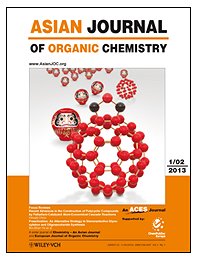 Of all the great covers that we’ve had in the Asian Journal of Organic Chemistry, the front cover of Issue 1, 2013, has been a great hit among our readers. The reasons for this are many, but to summarize, the image is not cluttered with numbers or data and the red and white color scheme is simple but striking. The C60 at the front gives a hint about the main theme of the manuscript, which is of course C60 chemistry, but it doesn’t give any exact details – you have to read the manuscript to get those! This cover also includes something from the culture of the authors, which makes it a little more mysterious and interesting.
When your artwork is selected to appear on the cover of a journal, it’s not just a matter of pretty pictures. It is also recognition that the science in your manuscript is of exceptionally high quality and should be highlighted to the community. In this respect, cover pictures look great in presentations as a way of showing the significance of the advances that you have made. Therefore, if you want to make a big splash with your cover picture, first and foremost you must make sure your research is something that everyone will want to shout about.
Other Examples
As a guide to what makes a successful cover picture, I asked the editors from some of the Asian Journal of Organic Chemistry’s sister journals to identify the cover art from their journals that have made the biggest impact with their readers and what they think the reasons for this are.
.jpg) |
Theresa Kueckmann, Chemistry – An Asian Journal All the essential information from the theme of the paper, which is about growing gold nanoparticles for the detection of biomolecules, is contained in this image, yet it doesn’t look at all technical. |
.jpg) |
Haymo Ross, European Journal of Organic Chemistry At first glance the picture looks tasty (unless you are a vegetarian) but you may wonder what it has to do with the chemistry. Then you understand that the ketchup (full of carbohydrates) is sticking to the solid matrix of the hot dog for solid-phase synthesis of glycopeptides! |
.jpg) |
Peter Gölitz, Angewandte Chemie There’s nothing we like more than chemistry that breaks out from the norms and makes us look at things from a different perspective. By presenting the chemical structure in an artistic way, this image makes us imagine the thought processes that the authors went through to design and make their treasure of a complex. |
.jpg) |
Lisa Abel, ChemBioChem A tremendous amount of thought and technical work went into producing a truly humorous and original idea that gives the paper context by playing on the theme of the “prebiotic soup”, which is what this manuscript is all about. |
.jpg) |
Michael Rowan, ChemCatChem This curious creature is really suited to the journal and gives you a sneak preview of what to expect inside this special issue on organocatalysis. This is a fun picture with a scientific message – the best of both worlds. |
.jpg) |
Neville Compton, Chemistry – A European Journal In the archives there is something that resonated with many people. Science is very often about putting the pieces of a puzzle together, and perhaps even more so in the structural elucidation/total synthesis of a natural product, in this case, one that comes from near the Himalayas. |
.jpg) |
Saskia Neubacher, ChemistryOpen Two beams of light with two data streams put the key molecular probe for dual-method surface analysis right in the spotlight through the clever use of depth and perspective. |
.jpg) |
Natalia Ortúzar, ChemMedChem Even without knowing anything about the paper, just by looking at this cover, it’s easy to see the target of this small molecule. The depiction of the body also makes the human connection with the reader. |
.jpg) |
Marisa Spiniello, ChemPlusChem This cover is colorful and hints at how multiple techniques were used to solve a problem about molecular conformations. It really describes the paper and, importantly, fits the scope of the journal well. |
.jpg) |
Greta Heydenrych, ChemPhysChem This cover shows in a nutshell what the article is about, which is nanofluidics. The authors do reuse some of the figures from their manuscript, but in such a way that one can really see that some thought has been put into the design of the cover and to ensure that the cover tells a story. Because it is such a striking cover, we are using it in our marketing material, thus giving the authors some extra exposure. |
.jpg) |
Guido Kemeling, ChemSusChem With the trees and the sun, this fantastic high-resolution photo is right on the topic of energy efficiency in biomass processing. |
.jpg) |
Karen Hindson, European Journal of Inorganic Chemistry The simple clean lines of this uncluttered picture, which nevertheless fills all corners of the parallelogram, catches the attention at once. The chemical relevance is immediately clear in the two almost identical structures, but so is the connection to IR photochemistry. It is a cover that, like all good art, delights on longer inspection with ever more details like the importance of the sodium ions moving up the trunk only to the left-hand brighter side of the tree. |


These samples are extremely helpful and right to the point. Thank you for sharing your knowledge and improving others.
I just finish to read all posts and I really enjoyed it. Thanks for the tips