Marco Rolandi, Karen Cheng, Sarah Pérez-Kriz, University of Washington, WA, USA, collected suggestions to help scientists and engineers create figures for publication. Visual representations can convey facts, ideas, and relationships far more clearly and concisely than descriptive text and figures are often the first part of a scientific paper that is reviewed by the editor, and if the paper is accepted, often the first part examined by your peers.
- Design the Figures for the Audience, Not for You.
A figure for a specialized journal may require a different design than a figure aimed at a broader readership. - Focus on the Most Important Information
Identify the storyline and how each figure will contribute to it. Ensure that every figure serves a well-defined purpose and is critical to the overall story.
Establish the key message for each figure. Every element in the figure should contribute to that message. Some results may be better suited for the Supporting Information, rather than being placed in an overwhelmingly complex and hard to understand figure. - Design a Clear Visual Structure
The visual composition should easily guide the viewer along a logical sequence of information. The top-left corner is a natural entry point for the viewer. Most people view an image by scanning from the top left to the lower right.
Viewers need an organizational structure to help guide them through a figure. A grid can be a useful tool in creating this structure as it can help organize disparate elements into visual groups. - Use Visual Contrast, But Keep Figures Simple
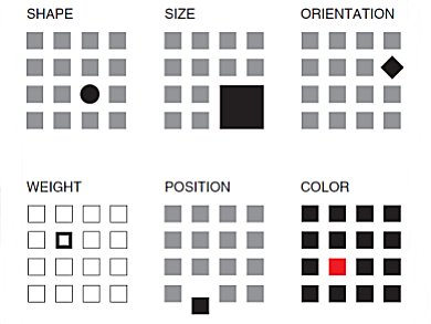
Use visual contrast to highlight the most important information. Typically, larger, darker, and brighter elements are more prominent than what is smaller, lighter, and duller (see picture). Too much contrast creates visual noise that obscures information.
Avoid using too many colors. Consider using a limited black-and-white palette rather than full color.
Remove all non-data elements that do not serve a communicative function. This includes decorative flourishes such as drop shadows, 3D extrusions, unnecessary gradients, etc. - Create Legible and Readable Typography
Text in figures should be clear and readable at a glance. Make sure that the text is readable after the graphic is resized to its final dimensions. Sans-serif typefaces such as Helvetica and Arial are often more legible than serifs when set in small sizes.
Maximize the contrast between type and background. A 70 % contrast of type and background, i.e., white type on a 70 % dark gray background, is optimal. Include scale bars and label the axes.
Consider whether the figure needs a legend to label the patterns and symbols used.
Last but not least: As with a manuscript, it is a good idea to ask a colleague, or if you are lucky, a friend with a design background, to review your work.
Image: © Wiley-VCH
Vary the shape, size, orientation, weight, position, or color of
an element or group of elements to make the key part of the figure
visually clear.
- A Brief Guide to Designing Effective Figures for the Scientific Paper,
Marco Rolandi, Karen Cheng, Sarah Pérez-Kriz,
Adv. Mat. 2011.
DOI: 10.1002/adma.201102518